John Hill and Jamie Coen.
The financial system is complex and highly interconnected. Indeed, interactions between agents are key to its functioning. But these interconnections have the potential to turn small shocks into systemic crises. Understanding the complex nature of these interconnections is important, but can also be difficult. In this post we introduce new tools designed to analyse the financial network and help analysts build a better understanding of risks posed by interconnectedness.
The global financial crisis showed us that interconnections between financial institutions can act to transmit and amplify shocks. They can also increase the complexity of the system, making it hard for firms to predict how shocks in other parts of the financial system will affect them.
This complexity stems from the myriad ways in which firms can be interconnected. Different asset classes give rise to different types of interconnectedness. For instance, a derivative contract gives rise to connections between firms that behave very differently to a loan contract. And the nature, scale and pattern of such interconnections change constantly as market conditions change.
Our work shows how new technology can help regulators gain a deeper understanding of the risks posed by financial system interconnectedness.
Networks and interconnectedness
When we talk about interconnectedness, we are by definition talking about networks. Networks are “groups or systems of interconnected people or things”. The financial network is a system of interconnected financial institutions.
The financial network is made up of a number of firms (nodes) and the interconnections between them (edges). Collectively, the arrangement of these nodes and edges give rise to the structure of the network as a whole. Understanding the financial network requires an understanding of all three facets: nodes, edges, and the network structure. Each facet is characterised by a number of attributes (Table 1):
- Node attributes: the properties of the firms that make up the system.
- Edge attributes: the properties of the exposures between firms.
- Network structure: the pattern of nodes and edges.
Table 1: Examples of node, edge and network attributes
| Node attributes | Edge attributes | Network attributes |
|
|
|
Because interconnectedness depends on so many different attributes, it can be hard to analyse empirically. Data need to be meshed together from a range of sources (e.g. exposures data, balance sheet data, and market data) and metrics need to be derived from these data (e.g. network statistics).
But it is not enough to measure each facet in isolation. For example, the size of an exposure (an edge attribute) should be considered relative to a bank’s total capital (a node attribute) in order to assess its importance as a transmitter of shocks between firms. Similarly, the propensity of a node to spread contagion depends in part on the structure of the network as a whole, and the node’s location within that network.
Designing a summary statistic (or set of summary statistics) to evaluate risks from interconnectedness may not be possible a priori. So analysts need the ability to interact with the data in a variety of ways in order to spot emerging risks.
Traditional data analysis is typically non-interactive. So we turned to the field of visual analytics – an emerging field that is concerned with analysing and visualising data interactively – for a solution.
Applying visual analytics to interconnectedness
The solution we came up with is an interactive environment that we call the Analytical Workbench. It is a proof-of-concept environment in which analysts can interact with a range of joined-up data, such as balance sheet data, data on the size and nature of banks’ exposures and market indicators.
This environment lets us analyse the financial system at the three levels of resolution we need to understand interconnectedness: the structure of the network, the characteristics of individual nodes, and the nature of the links between nodes. It offers a range of tools with which to interrogate these data. Available tools include network visualisations, network analytics, and standard graphing functionality (e.g. bar charts).
In the text below we demonstrate how interactive tools can help us gain insight into complex issues. We start with the high-level question ‘what does the UK financial network look like?’, and let our curiosity take us from there…
Figure 1 is a representation of UK banks’ exposures, where dots (nodes) represent institutions and different coloured lines (edges) represent different types of exposure. This chart shows that there is a core of highly connected institutions at the centre of the financial system (i.e. the UK financial system exhibits a core-periphery structure). This begs the question ‘Who are these key institutions in this network, and how risky are these banks’ exposures?’ These questions concern the individual nodes and edges which comprise the network. To answer them, we need to drill down into the detailed underlying information about nodes and edges that is concealed at the network level.
Figure 1 The UK exposures network

But first, let’s use another visualisation to isolate the most connected banks in the system – only those with 10 connections or more – and highlight the exposures of an anonymous bank which we will call Bank A (Figure 2). Here we see that each of the banks in the core, and in particular Bank A, has a lot of links with other core banks. Network centrality measures, shown in Figures 3 & 4, confirm this. Bank A has the most connections in the network (degree centrality) and is generally connected to banks that are themselves central nodes (eigenvector centrality). On these measures, Bank A is a relatively important node in the context of the UK financial network. And due to the concentrated nature of the UK banking system, it is likely that Bank A is also important in an absolute sense.
Figure 2 The core of the UK derivatives network
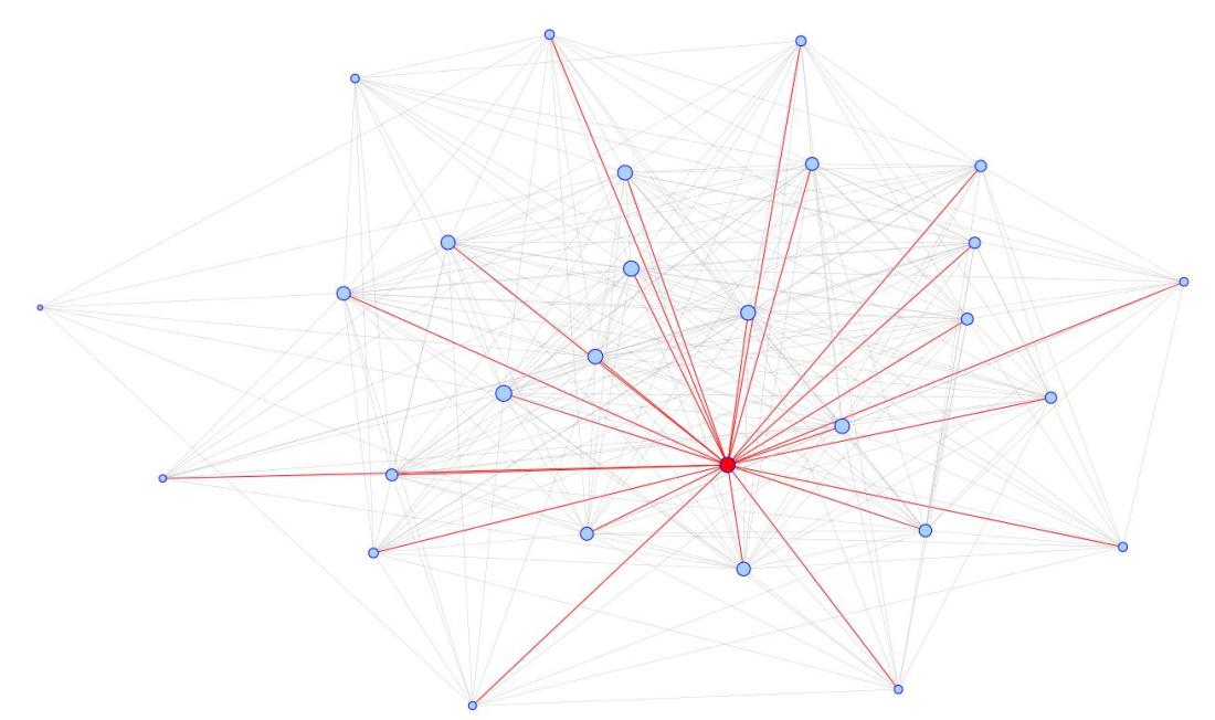
Figure 3 Banks by degree centrality

Figure 4 Banks by eigenvector centrality

Having established the structure of the network, and which the central nodes are, the next step is to ask what risks these nodes pose to the network as a whole. One way in which risk can spread through the network is via direct contagion. Contagion travels along the edges of a network, following shocks to nodes. Large exposures are likely to be the edges which most readily transmit contagion.
Another visualisation (Figure 5) lets us investigate Bank A’s exposures. We can see that, even after taking into account offsetting collateral, Bank A has a number of sizeable exposures to its counterparties. Taken together, the figures in this section suggest that were a default to occur, Bank A has the potential to be one of the network’s super-spreaders of contagion.
Figure 5 Bank A’s derivative counterparty exposures

Note: This chart is based on artificial data
Operationalising Visual Analytics
In the past we had to make do with fairly limited economic data. Today, larger and more complex data are increasingly becoming available to economists. Alongside this, new tools and techniques from the world of network analysis provide the conceptual framework to analyse these data. To make the most of these opportunities, the modern economist needs new tools. Recent advances in technology make it possible to build interactive tools. We think that our work offers an early blueprint for what these tools might look like.
But there are outstanding challenges that need to be overcome before this type of analysis becomes mainstream. The chief challenges to overcome are organisational. Building these types of tool needs an interdisciplinary team: a mix of data experts, software developers and economists. And there is a significant lead-time before they pay-back their investment.
The opportunities are significant. One of the main risks that analysis of interconnectedness helps us get to grips with is feedback loops – powerful processes that can amplify a small initial disturbance into a large perturbation. Indeed, the science of visual analytics itself relies on a feedback loop, albeit a beneficial one. Each time a dataset is added, a new analytical tool developed, or a new output is designed, interactive tools become increasingly more powerful. It is a nice thought that harnessing this positive feedback loop could help analysts to better understand the harmful ones that threaten financial stability.
Looking to the future, Andy Haldane dreams of tracking the UK economy from a Star Trek chair in front of a bank of monitors. We think our work is one small step towards making this vision a reality.
John Hill and Jamie Coen work in the Bank’s Banking Analysis and Support Division.
If you want to get in touch, please email us at bankunderground@bankofengland.co.uk. You are also welcome to leave a comment below. Comments are moderated and will not appear until they have been approved.
Bank Underground is a blog for Bank of England staff to share views that challenge – or support – prevailing policy orthodoxies. The views expressed here are those of the authors, and are not necessarily those of the Bank of England, or its policy committees.
It is sad that banks and their supporters try to portray banking as complex. Reduced to simple double entry bookkeeping, it is extremely simple. But then I am an accountant and not a banker.
I enjoy your complexity work very much and assign Andy Haldane’s articles to my PhD students in the course I teach on Far from Equilibrium Economics and Finance at Claremont Graduate University.
Dr. John Rutledge
drjohnrutledge@mac.com
Eigenvector centrality might be a very misleading measure. Assume that there are three banks, A, B, C. There are two industrial corporations, I and II. (Readers are asked not to comment on whether finance is 50% bigger than manufacturing.) Industrial corporation I has credit lines with both A and B. Industrial corporation II has a credit line with only C. And, of course, all the banks are connected to each other.
Then the lead eigenvector (in the order {A, B, C, I, II}) is {4.2, 4.2, 3.6, 3.2, 1.}. But each of the customers of bank A and B (I) have a backup bank, but not the customers of C (II). So the demise of A or B would be less bad than the demise of C. Yet A and B have higher eigenvector centrality.
Very Good Article and informative but, simply when we analyze markets and interconnections we simply view the “Mood of people” which reflects in the Markets.( Apply Socionomics) in conjunction with Wave analysis and history. With a eye on Black Swan possibilities
If you apply to current Markets, these current moves and interconnections were seen well in advance and there is a lot more to come. The Market and interconnections have changed and for some time to come.
The Nodes, Edge, Networks – interconnection will see and feel a financial event which will transmit throughout the entire system/network.